Custom View
OverView
The OpenSumi view is based on the slot mechanism design, where the entire Layout itself is a large React component that divides the view into several slots. For example, by default the layout component provided by OpenSumi divides the view into slot templates as shown in the following figure:

Slots are used to mount component views and each slot consumes a data structure as follows:
type ComponentsInfo = Array<{
  views: View[];
  options?: ViewContainerOptions;
}>;
export interface View {
  // Irrelevant options have been hidden
  component: React.ComponentType<any>;
}
Slot renderer determines how data is consumed. By default, the view is laid out tiled from top to bottom. In sidebar and bottom bar, by default the slot renderer is the TabBar component that supports collapsing and expanding and toggling. Except for the sidebar area that supports multiple subviews though accordion, other places will only consume the first view of views by default.
The data provider offers LayoutConfig for the view configuration. The following code shows its data structure.
export const defaultConfig: LayoutConfig = {
  [SlotLocation.top]: {
    modules: ['@opensumi/ide-menu-bar']
  },
  [SlotLocation.left]: {
    modules: [
      '@opensumi/ide-explorer',
      '@opensumi/ide-search',
      '@opensumi/ide-scm',
      '@opensumi/ide-extension-manager',
      '@opensumi/ide-debug'
    ]
  }
};
The Token of the view is registered and connected with the real React component by ComponentContribution.
import { Search } from './search.view';

@Domain(ComponentContribution)
export class SearchContribution implements ComponentContribution {
  registerComponent(registry: ComponentRegistry) {
    registry.register('@opensumi/ide-search', [], {
      containerId: SEARCH_CONTAINER_ID,
      iconClass: getIcon('search'),
      title: localize('search.title'),
      component: Search,
      priority: 9
    });
  }
}
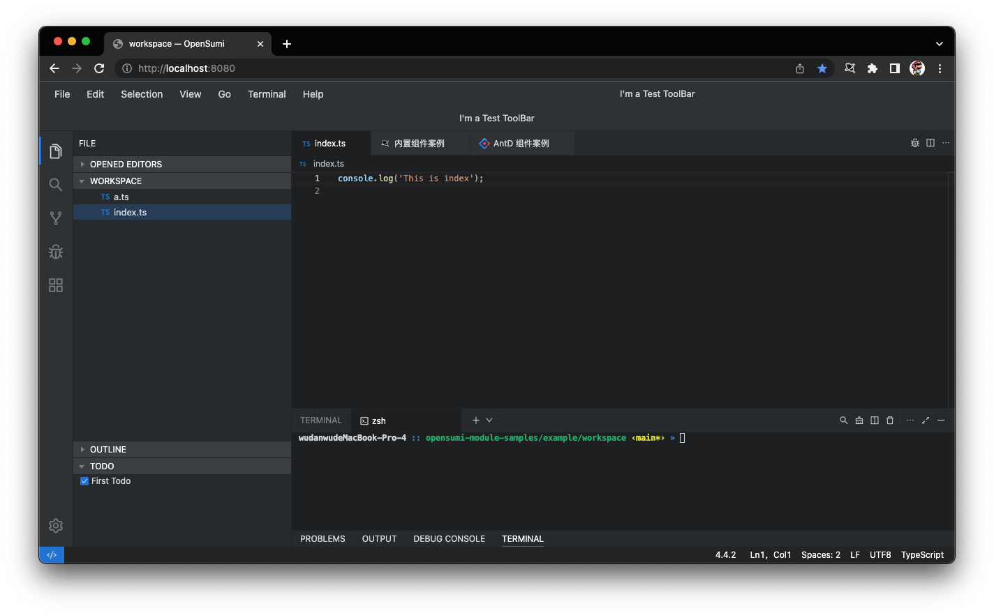
The following picture is an example of customizing Layout by adding a ToolBar component to the right side of MenuBar.

Code sample here: Custom View
View Registration
First we need to register the ToolBar component to connect it to string Token test-toolbar.
export const TestToolbar = () => (
  <div
    style={{
      lineHeight: '35px',
      flex: 1,
      padding: '0 20px',
      textAlign: 'center',
      backgroundColor: 'var(--kt-menubar-background)'
    }}
  >
    I'm a Test ToolBar
  </div>
);@Domain(ComponentContribution)
export class TestContribution implements ComponentContribution {
registerComponent(registry: ComponentRegistry) {
registry.register(
'test-toolbar',
[
{
id: 'test-toolbar',
component: TestToolbar,
name: 'Test'
}
],
{
containerId: 'test-toolbar'
}
);
}
}Notice: Using Bottom Slot
If you are using the SlotLocation.bottom, there has a style applied to bottom slot view wrapper: overflow: hidden;.
So if you need scroll effect on your component, please add a additional div with overflow: auto in the outside of your component:
export const BottomView = () => (
  <div
    style={{
      overflow: auto,
    }}
  >
    <App />
  </div>
);
View Consumption
For this demand, there are two options to support view rendering:
- Replace the top slot renderer to support left and right tiling
- Map out a new slot location on the layout component that supports ToolBar registration alone
Custom Slot Renderers
Replace the top SlotRenderer with the SlotRenderer Contribution, changing the default top and bottom tiled mode into a horizontal flex mode:
export const TopSlotRenderer: (props: {
  className: string;
  components: ComponentRegistryInfo[];
}) => any = ({ className, components }) => {
  const tmp = components.map(item => item.views[0].component!);
  return (
    <div style={{ display: 'flex', justifyContent: 'space-between' }}>
      {tmp.map((Component, index) => (
        <Component key={index} />
      ))}
    </div>
  );
};

@Domain(SlotRendererContribution)
export class TestToolbarSlotContribution implements SlotRendererContribution {
  registerRenderer(registry: SlotRendererRegistry) {
    registry.registerSlotRenderer(SlotLocation.top, TopSlotRenderer);
  }
}
Then, you can add the test-toolbar component to the top slot.
renderApp({
  ...
  [SlotLocation.top]: {
    modules: ['@opensumi/ide-menu-bar', 'test-toolbar']
  }
  ...
});
Add Slot Positions
To Add a slot position is very simple: just put the SlotRenderer component into the view. Layout is designed to be flexible and you can insert this renderer anywhere. In this case, you can choose to add the position in the Layout component or within the MenuBar view:
export function LayoutComponent() {
  return (
    <BoxPanel direction="top-to-bottom">
      <BoxPanel direction="left-to-right">
        <SlotRenderer
          color={colors.menuBarBackground}
          defaultSize={35}
          slot="top"
        />
        // 增加一个slot插槽
        <SlotRenderer
          color={colors.menuBarBackground}
          defaultSize={35}
          slot="customAction"
        />
      </BoxPanel>
    </BoxPanel>
  );
}

// Or add new Slot in the MenuBar Slot
export const MenuBarMixToolbarAction: React.FC<MenuBarMixToolbarActionProps> = props => {
  return (
    <div className={clx(styles.MenuBarWrapper, props.className)}>
      <MenuBar />
      <SlotRenderer slot="customAction" flex={1} overflow={'initial'} />
    </div>
  );
};
After adding the slot location, you can put on the corresponding location and view Token in the view configuration.
renderApp({
  ...
  customAction: {
    modules: ['test-toolbar']
  }
  ...
});
Extended Reading
In general, preceding methods can complete the layout requirements of common custom, but for some needs, such as, drag and change size, view, switching functions of customization scenarios, it would be more complicated to start writing with native HTML directly, and the interaction is inconsistent. OpenSumi provides several types of basic components that can be used to build layouts.
- The Layout Basic components
- BoxPanel,a common Flex layout component that supports Flex layouts in different directions
- SplitPanel,a class of BoxPanel that Supports mouse drag and drop to change the size
- Slot renderer implementation component
- Accordion,accordion component,support all capabilities of SplitPanel,as well as the control of folding and expanding subview panels
- TabBar,a multi-tab management component, supports view activation, folding, expansion, and switching, and supports Tab drag to change position
- TabPanel,Tab rendering component. Its sidebar is Panel Title + Accordion. The bottom column is the ordinary React view
For details about how to use components, see the component type declaration.
