Toolbar
By designed, the OpenSumi contribution points in the current framework need to be declared using
kaitianContributes. After upgrading to OpenSumi 2.25.0,sumiContributescan be used to declare, and it will also be compatible with the oldkaitianContributesdeclaration.
The Toolbar is located on the right side of the top menu bar of the IDE by default. According to the configuration of different integrators, it can also be displayed as a separate column, similar to the Alipay applet developer tools. As shown below:


The Toolbar contribution point can describe the elements on the toolbar through JSON configuration. Currently, it supports button and select, which we call action. In some cases, it needs to be used with the Toolbar API.
Button button
button is a clickable element that supports two display modes: icon only, icon + text, and the user can modify the button style by setting. In the plug-in, you can customize the button style and its icon by configuring the contributions.
The action type of the button type is described as follows:
export interface IToolbarActionBasicContribution {
  id: string;
  /**
   * Register the preferred position of this action, if strictPosition exists, this option is invalid
   *
   * rule:
   * Note: Each location has two groups _head _tail by default, representing the first and last group
   * 1. If the group value is provided, and the group is not _head and _tail
   * 1. If the group has been registered, register it in the group and follow the group
   * 3. If group is not registered
   * 1. If the location exists, it will appear in the _tail of the specified location
   * 2. If the location does not exist, it will appear in the _tail of the default location
   * 2. If a group value is provided, and group is _head or _tail
   * 1. If the location is registered, it will appear in the group location of the specified location.
   * 2. If the location is not registered it will appear in the group location of the default location.
   * 3. If only location value is provided
   * 1. If the location is registered, it will appear in the _tail position of the specified location.
   * 2. If the location is not registered it will appear in the _tail position of the default location.
   * 4. If there is no position suggestion, it will appear in the _tail of the default location
   *
   * The real position will not be calculated repeatedly, it is only calculated when the Toolbar is rendered for the first time (onStart), or when the action is registered after rendering.
   * But order will be calculated repeatedly.
   */
  preferredPosition?: {
    /**
     * location refers to the position of a tool bar unit. Due to the different integration of the Kaitian framework, in different IDE integration products,
     * There may be different optional values for location.
     *
     * Generally speaking, the default location of the desktop version will have
     * toolbar-left (toolbar left)
     * toolbar-right (the right side of the tool bar)
     * toolbar-center (toolbar center)
     *
     * On the web version of the IDE, these two additional
     * menu-left (top menu right to left)
     * menu-right (top menu left to right)
     *
     *Other locations may require specific integration offerings
     *
     * Each integrated product will have a default location, if the location specified by preferredPosition cannot be found
     * will be placed in the default locaiton
     */
    location?: string;

    /**
     * Multiple buttons can be grouped, and there will be a dividing line between groups to indicate division
     * At present, plugins can only be registered to the existing group of the integrated IDE button, but not a custom group, this feature may be added in the future
     * Each location has two built-in groups of _head and _tail by default, which are used to represent the leftmost and rightmost of this location respectively
     * Buttons without specified group will be placed in _tail by default
     */
    group?: string;
  };
  /**
   * If this value exists, the specified location will be searched forever.
   * If the location cannot be found (such as location does not exist, or group does not exist), this button will not be displayed
   */
  strictPosition?: {
    location: string;
    group: string;
  };
  description: string;
}

export interface IToolbarActionBtnStyle {
  // Whether to display the Title
  // Default is false
  showTitle?: boolean;

  // icon foreground color
  iconForeground?: string;

  // icon background color
  iconBackground?: string;

  // title foreground color
  titleForeground?: string;

  // title background color
  titleBackground?: string;

  // overall background color
  background?: string;

  // style type,
  // inline will not have an outer border
  // button is the button style
  // Default is button
  // inline mode showTitle will be invalid, only icon will be displayed
  btnStyle?: 'inline' | 'button';

  // button's text position style
  // vertical: upper icon lower text
  // horizontal: left icon right text
  btnTitleStyle?: 'vertical' | 'horizontal';
}

export interface IToolbarButtonContribution
  extends IToolbarActionBasicContribution {
  type: 'button';
  // The command triggered after the button is clicked, if not specified, you need to bind the event through the API
  command?: string;
  // button text
  title: string;
  // Button icon path, relative to the plug-in root directory, if the icon is in /path/to/ext/resource/a.svg, it needs to be written as resource/a.svg
  iconPath: string;
  // icon rendering mode, can be left blank in most cases
  iconMaskMode?: boolean;
  // button state, here mainly refers to the style, similar to declaring a set of classname, the style state of the button can be changed through the API
  states?: {
    [key: string]: {
      title?: string;
      iconPath?: string;
      iconMaskMode?: boolean;
    } & IToolbarActionBtnStyle;
  };
  defaultState?: string;
}
Define button
By declaring toolbar.actions in kaitianContributes, you can register a button type action
{
  "kaitianContributes": {
    "toolbar": {
      "actions": [
        {
          // Indicates an action of type button
          "type": "button",
          "title": "Print",
          "iconPath": "./icons/gua.svg",
          "id": "common-start",
          // Define several states of the button
          "states": {
            "default": {
              "btnTitleStyle": "horizontal"
            },
            // gray in clicked state
            "clicked": {
              "showTitle": true,
              "titleForeground": "#CCC",
              "btnTitleStyle": "horizontal"
            }
          }
        }
      ]
    }
  }
}
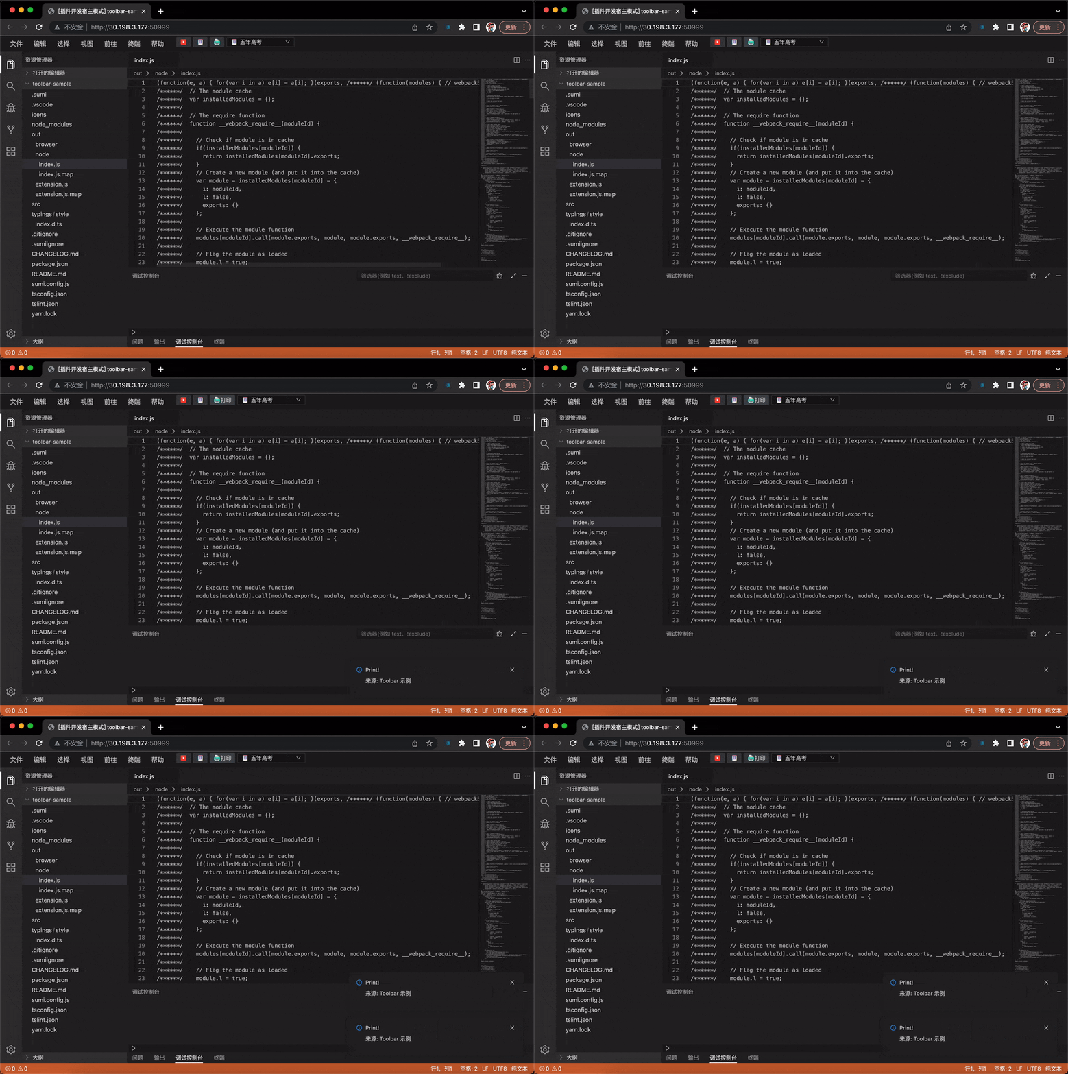
This renders an icon-only button on the right. Now clicking the button will not have any response, because the click event of the button has not been processed. There are two ways to handle the click event.
- Binding Command
- Obtain the instance of the button through the Toolbar API, and listen to the click event
Binding Command
In the definition of the above contributions, add a command field for the Print button:
{
  //...
  "type": "button",
  "title": "Print",
  "command": "button-click-command"
  //...
}
This command needs to be registered in the plug-in code, and it will be executed automatically when the button is clicked
import * as sumi from 'sumi';

export function activate() {
  sumi.commands.registerCommand('button-click-command', () => {
    sumi.window.showInformationMessage('Print!');
  });
}
In the example, we have customized a set of clicked states, which can be switched to clicked when clicked through the Toolbar API
import * as sumi from 'sumi';

export function activate() {
  sumi.commands.registerCommand('button-click-command', async () => {
    const toolbar = await sumi.toolbar.getToolbarActionButtonHandle(
      'common-start'
    );
    toolbar.setState('clicked');
    sumi.window.showInformationMessage('Bingo!');
  });
}
Customize Popover
The Popover component that pops up after the Button is clicked can be specified in kaitianContributes through declarative configuration. The code example is as follows:
// package.json #kaitianContributes
{
  "toolbar": {
    "actions": [
      {
        "type": "button",
        "title": "Popup",
        "iconPath": "./icons/book.svg",
        "id": "popover-start",
        "command": "popover-command",
        "popoverComponent": "CustomPopover",
        "popoverStyle": {
          "minWidth": "200",
          "minHeight": "200"
        },
        "states": {
          "default": {
            "titleForeground": "#FF004F"
          },
          "clicked": {
            "titleForeground": "#CCC"
          }
        }
      }
    ]
  }
}
Components need to be implemented by developers themselves and exported in browser/index.ts.
// browser/index.ts
import * as React from 'react';
import { useEffect } from 'react';
import { commands } from 'kaitian-browser';

export const CustomPopover = props => {
  useEffect(() => {
    console.log('do something...');
    return () => {
      console.log('dispose custom popover...');
    };
  }, []);

  return (
    <div style={{ width: 200, height: 200, padding: 10 }}>
      Hello {props.context?.name}
      <button
        onClick={() => {
          commands.executeCommand('popup.testCommand');
        }}
      >
        Execute Command
      </button>
    </div>
  );
};
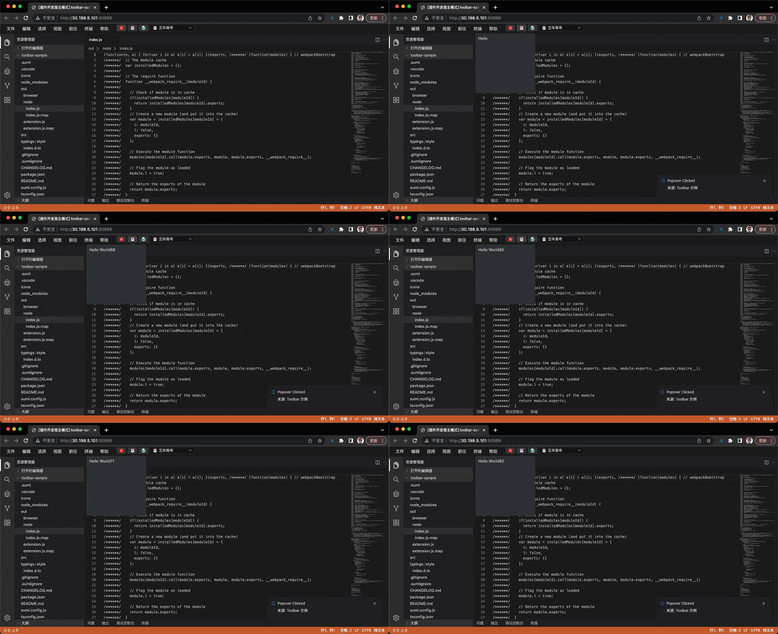
In this code, a context object can be obtained from props, and the context can be dynamically updated by calling actionHandler API from the plug-in Node side.
The Popover can obtain the state passed in by NodeJS from props.context, and it can also use commands.executeCommand to invoke the Commands registered in NodeJS.
// node/index.ts
export function activate() {
  const action = await kaitian.toolbar.getToolbarActionButtonHandle(
    'sample-start'
  );

  kaitian.commands.registerCommand('popup.testCommand', () => {
    console.log('command executed');
  });

  action.onClick(() => {
    action.showPopover();
  });

  setInterval(() => {
    action.setContext({
      // Update context value regularly
      name: 'World' + Math.round(Math.random() * 100)
    });
  }, 1000);
}
The effect is as follows:

Select dropdown option
Select is a selectable drop-down box, which can declare a set of value lists through contribution points. You can also bind a command to Select, or register selection events through Toolbar API.
The type declaration of the Select action is as follows:
export interface IToolbarSelectContribution<T = any>
extends IToolbarActionBasicContribution {
type: 'select';
// The command triggered after select is selected, and the new value can be obtained in the callback function
command?: string;
// define a set of options
options: {
// same as button
iconPath?: string;
iconMaskMode?: boolean;
// display text
label?: string;
// value
value: T;
}[];
// Defaults
defaultValue: T;
// The key used to compare whether the values are equal
optionEqualityKey?: string;
// style state
states?: {
[key: string]: IToolbarSelectStyle;
};
defaultState?: string;
}Define the drop-down box
An action of select type can be registered by declaring toolbar.actions in kaitianContributes.
{
"kaitianContributes": {
   "toolbar": {
       "actions": [
         {
           "type": "select",
           "description": "What to give for Children's Day",
           // bind do-select command
           "command": "do-select",
           "id": "common-select",
           "iconMaskMode": false,
           // select dropdown value list
           "options": [
             {
               "iconPath": "/icons/gift.svg",
               "label": "gift",
               "value": "gift"
             },
             {
               "iconPath": "/icons/book.svg",
               "label": "Five-year college entrance examination",
               "value": "book"
             }
           ],
           "states": {
             // default state
             "default": {
               "labelForegroundColor": "#FF004F"
             },
             "clicked": {
               "labelForegroundColor": "#CCC"
             }
           }
         }
       ]
     },
   }
}
bind command
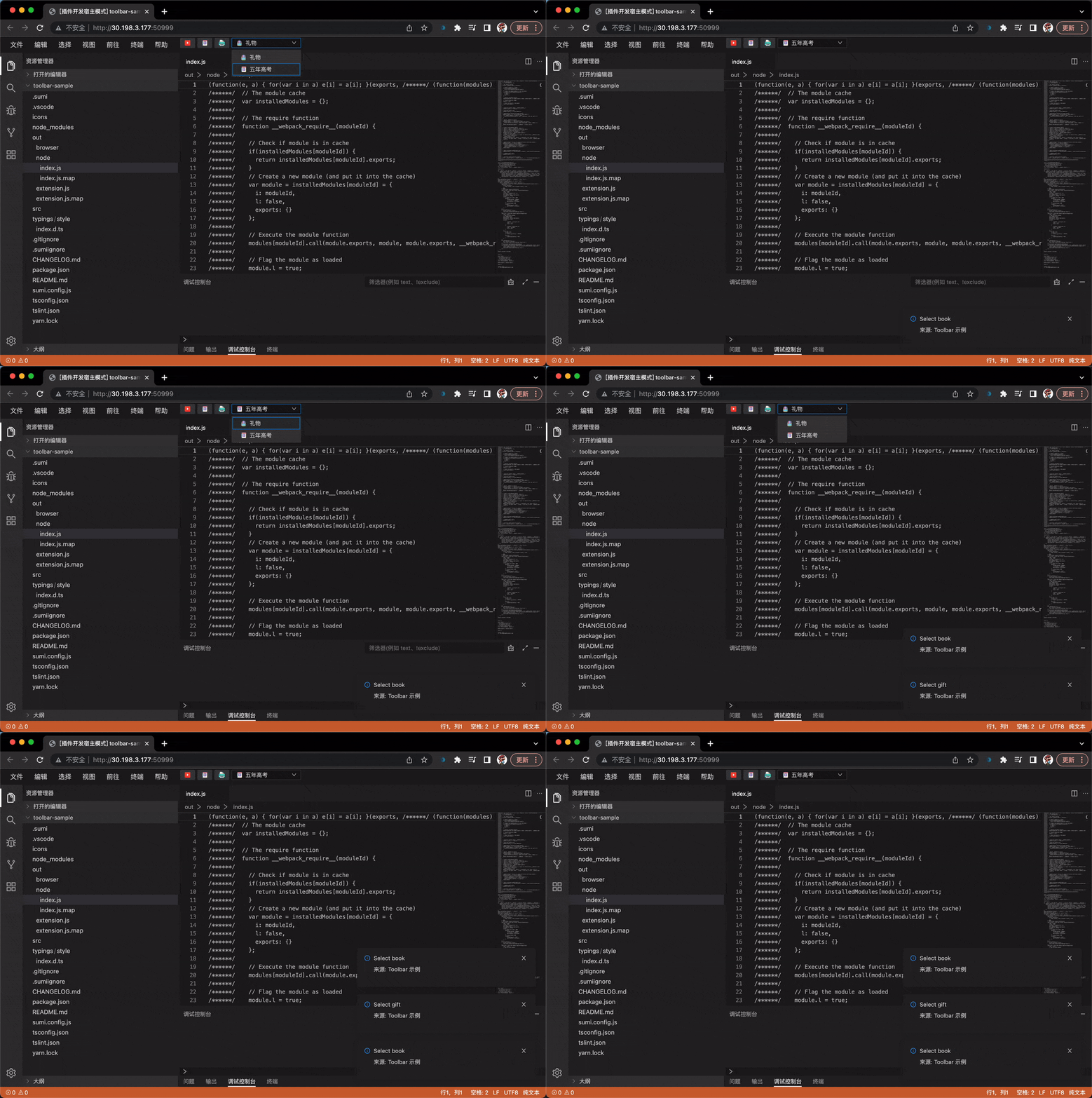
The do-select command is bound in the example, which needs to be registered in the plugin code.
import * as sumi from 'sumi';

export function activate() {
  sumi.commands.registerCommand('do-select', async vlaue => {
    const toolbar = await sumi.toolbar.getToolbarActionSelectHandle(
      'common-select'
    );
    toolbar.setState('clicked');
    sumi.window.showInformationMessage(`Select ${vlaue}`);
  });
}
The effect is as follows:

Update Options
After getting the selectHandle with getToolbarActionSelectHandle, you can call the setOptions method to update its option list.
import * as sumi from 'sumi';

export function activate() {
  sumi.commands.registerCommand('do-select', async vlaue => {
    const toolbar = await sumi.toolbar.getToolbarActionSelectHandle(
      'common-select'
    );
    toolbar.setState('clicked');
    sumi.window.showInformationMessage(`Select ${vlaue}`);
    toolbar.setOptions(
      {
        iconPath: '/icons/gift.svg',
        label: 'gift',
        value: 'gift'
      },
      {
        iconPath: '/icons/book.svg',
        label: 'Five-year college entrance examination',
        value: 'book'
      },
      {
        iconPath: './icons/book2.svg',
        label: 'Three-Year Simulation',
        value: 'book2'
      }
    );
  });
}
Update selected items
After getting the selectHandle with getToolbarActionSelectHandle, you can call the setSelect method to update its option list.
import * as vscode from 'vscode';
import * as kaitian from 'kaitian';

export function activate() {
  vscode.commands.registerCommand('do-select', async vlaue => {
    const toolbar = await vscode.toolbar.getToolbarActionSelectHandle(
      'common-select'
    );
    toolbar.setState('clicked');
    vscode.window.showInformationMessage(`Select ${vlaue}`);
    toolbar.setOptions(
      {
        iconPath: '/icons/gift.svg',
        label: 'gift',
        value: 'gift'
      },
      {
        iconPath: '/icons/book.svg',
        label: 'Five-year college entrance examination',
        value: 'book'
      },
      {
        iconPath: './icons/book2.svg',
        label: 'Three-Year Simulation',
        value: 'book2'
      }
    );
  });
  toolbar.setSelect('book'); // "Five-year college entrance examination" will be selected here
}