
Toolbar
由于历史原因,当前框架内声明 OpenSumi 贡献点需要使用
kaitianContributes进行声明,在升级至 OpenSumi 2.25.0 版本后,可以使用sumiContributes进行声明,同时也会兼容旧的kaitianContributes声明。
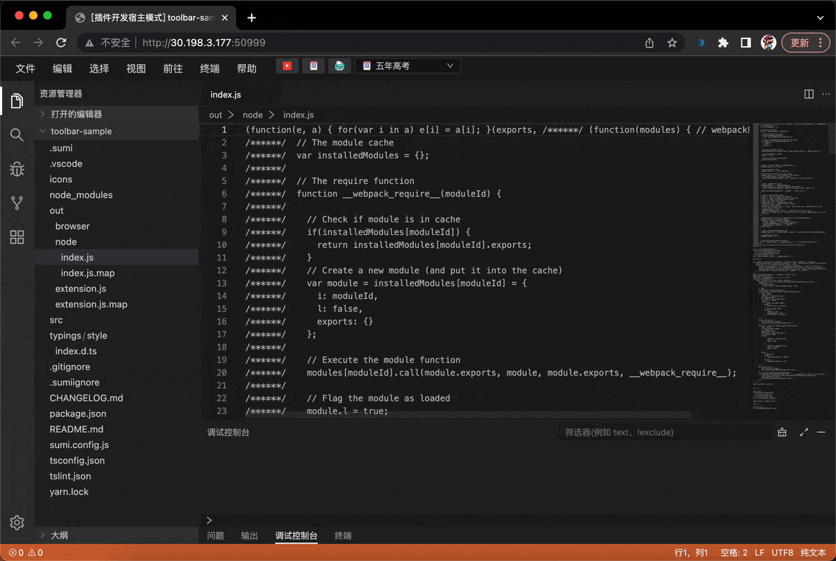
Toolbar 默认位于 IDE 顶部菜单栏右侧,根据不同集成方的配置,也可以展现为单独的一栏,类似支付宝小程序开发者工具。如下图所示:


Toolbar 贡献点可以通过 JSON 配置来描述工具栏上的元素,目前支持 button 及 select 两种方式,我们称之为 action,在某些情况下需搭配 Toolbar API 来使用。
Button 按钮
button 是一个可点击的元素,支持仅图标、图标+文字两种显示模式,用户可以通过设置的方式修改按钮样式。插件中可以通过配置 contributes 的方式自定义按钮样式及其图标等。
button 类��型的 action 类型描述如下:
export interface IToolbarActionBasicContribution {
  id: string;
  /**
   * 注册这个 action 喜好的位置, 如果 strictPosition 存在,这个选项无效
   *
   * 规则:
   * 注: 每个 location 默认存在 _head  _tail 两个group,代表了第一个和最后一个group
   * 1. 如果提供 group 值, 且 group 不为 _head 和 _tail
   *    1. 如果 group 已注册, 将其注册在group内,跟随 group 出现
   *    3. 如果 group 未注册
   *        1. 如果 location 存在, 它会出现在指定 location 的 _tail
   *        2. 如果 location 不存在, 它会出现在默认 location 的 _tail
   * 2. 如果提供 group 值, 且 group 为 _head 或 _tail
   *    1. 如果 location 已注册, 它会出现在指定 location 的 group 位置。
   *    2. 如果 location 未注册 它会出现在默认 location 的 group 位置。
   * 3. 如果仅仅提供 location 值
   *    1. 如果 location 已注册, 它会出现在指定 location 的 _tail 位置。
   *    2. 如果 location 未注册 它会出现在默认 location 的 _tail 位置。
   * 4. 如果什么 position 建议都没有,出现在 默认location 的 _tail
   *
   * 真实的位置不会反复计算,仅仅在Toolbar首次渲染时(onStart)计算,或者渲染后 action 注册时计算。
   * 但是 order 会反复计算。
   */
  preferredPosition?: {
    /**
     * location 是指一个工具条单元的位置,由于开天框架的集成不同,在不同的 IDE 集成产品中,
     * 可能存在不同的 location 可选值。
     *
     * 一般来说,桌面版本版默认的位置会有
     * toolbar-left(工具条左侧)
     * toolbar-right(工具条右侧)
     * toolbar-center (工具条中央)
     *
     * 在 web 版本的 IDE 上,会额外存在这两个
     * menu-left (顶部菜单右侧靠左)
     * menu-right (顶部菜单左侧靠右)
     *
     * 其他位置可能需要具体的集成产品提供
     *
     * 每个集成产品都会有一个默认的 location,如果找不到 preferredPosition 指定的位置
     * 则会放到默认的 locaiton
     */
    location?: string;

    /**
     * 多个按钮可以成组,组与组之间会存在分割线表示分割
     * 目前插件只能注册到集成 IDE 按钮已经存在的组中,而不能自定义组,这个特性可能未来添加
     * 每个 location 都默认存在 _head 和 _tail 两个内置组,分别用来表示这个位置的最左侧和最右侧
     * 没有指定 group 的按钮都会默认放到 _tail 中
     */
    group?: string;
  };
  /**
   * 如果存在这个值,会永远寻找指定的位置。
   * 如果这位置无法被找到(比如 location 不存在,或者group不存在),则这个按钮不会被显示
   */
  strictPosition?: {
    location: string;
    group: string;
  };
  description: string;
}

export interface IToolbarActionBtnStyle {
  // 是否显示 Title
  // 默认为 false
  showTitle?: boolean;

  // icon 前景色
  iconForeground?: string;

  // icon 背景色
  iconBackground?: string;

  // title 前景色
  titleForeground?: string;

  // title 背景色
  titleBackground?: string;

  // 整体背景色
  background?: string;

  // 样式类型,
  // inline则不会有外边框
  // button则为按钮样式
  // 默认为 button
  // inline 模式showTitle会失效, 只显示icon
  btnStyle?: 'inline' | 'button';

  // button 的文本位置样式
  // vertical: 上icon 下文本
  // horizontal: 左icon 右文本
  btnTitleStyle?: 'vertical' | 'horizontal';
}

export interface IToolbarButtonContribution
  extends IToolbarActionBasicContribution {
  type: 'button';
  // 按钮点击后触发的 command,若不指定,则需要通过 API 绑定事件
  command?: string;
  // 按钮文案
  title: string;
  // 按钮图标路径,相对于插件根目录,如图标在 /path/to/ext/resource/a.svg, 则需写为 resource/a.svg
  iconPath: string;
  // icon 渲染模式,大部分情况下可不填
  iconMaskMode?: boolean;
  // 按钮状态,这里主要指样式,类似声明一组 classname,可通过 API 改变按钮的样式状态
  states?: {
    [key: string]: {
      title?: string;
      iconPath?: string;
      iconMaskMode?: boolean;
    } & IToolbarActionBtnStyle;
  };
  defaultState?: string;
}
定义按钮
通过 kaitianContributes, 中声明 toolbar.actions 的方式可以注册一个 button 类型的 action
{
  "kaitianContributes": {
    "toolbar": {
      "actions": [
        {
          // 表示类型为 button 的 action
          "type": "button",
          "title": "打印",
          "iconPath": "./icons/gua.svg",
          "id": "common-start",
          // 定义按钮的几种状态
          "states": {
            "default": {
              "btnTitleStyle": "horizontal"
            },
            // clicked 状态下为灰色
            "clicked": {
              "showTitle": true,
              "titleForeground": "#CCC",
              "btnTitleStyle": "horizontal"
            }
          }
        }
      ]
    }
  }
}
这会在右侧渲染一个只有图标的按钮。现在点击按钮并不会有任何反应,因为还没有对按钮的点击事件做处理,处理点击事件有两种方式。
- 绑定 Command
- 通过 Toolbar API 获取按钮的实例,监听点击事件
绑定 Command
在上述 contributes 的定义中,为 打印 按钮添加一个 command 字段:
{
  //...
  "type": "button",
  "title": "打印",
  "command": "button-click-command"
  // ...
}
插件代码中需要注册这个 command,当点击按钮后会自动执行
import * as sumi from 'sumi';

export function activate() {
  sumi.commands.registerCommand('button-click-command', () => {
    sumi.window.showInformationMessage('Print!');
  });
}
示例中我们自定义了一组 clicked 状态,通过 Toolbar API 可以在点击时切换为 clicked
import * as sumi from 'sumi';

export function activate() {
  sumi.commands.registerCommand('button-click-command', async () => {
    const toolbar = await sumi.toolbar.getToolbarActionButtonHandle(
      'common-start'
    );
    toolbar.setState('clicked');
    sumi.window.showInformationMessage('Bingo!');
  });
}
效果如下:
自定义 Popover
可以通过声明式的配置在 kaitianContributes 中指定该 Button 点击后弹出的 Popover 组件,代码示例如下:
// package.json # kaitianContributes
{
  "toolbar": {
    "actions": [
      {
        "type": "button",
        "title": "弹窗 (Popover)",
        "iconPath": "./icons/book.svg",
        "id": "popover-start",
        "command": "popover-command",
        "popoverComponent": "CustomPopover",
        "popoverStyle": {
          "minWidth": "200",
          "minHeight": "200"
        },
        "states": {
          "default": {
            "titleForeground": "#FF004F"
          },
          "clicked": {
            "titleForeground": "#CCC"
          }
        }
      }
    ]
  }
}
组件需要开发者自行实现,并在 browser/index.ts 中导出。
// browser/index.ts
import * as React from 'react';
import { useEffect } from 'react';
import { commands } from 'kaitian-browser';

export const CustomPopover = props => {
  useEffect(() => {
    console.log('do something...');
    return () => {
      console.log('dispose custom popover...');
    };
  }, []);

  return (
    <div style={{ width: 200, height: 200, padding: 10 }}>
      Hello {props.context?.name}
      <button
        onClick={() => {
          commands.executeCommand('popup.testCommand');
        }}
      >
        调用 Command
      </button>
    </div>
  );
};
这段代码中,可以从 props 获取一个 context 对象,context 可以通过插件 Node 端调用 actionHandler API 来动态更新。
Popover 可以从 props.context 中获取到 NodeJS 传入的状态,同时又可以使用 commands.executeCommand 来调用 NodeJS 中注册的 Commands。
// node/index.ts
export function activate() {
  const action = await kaitian.toolbar.getToolbarActionButtonHandle(
    'sample-start'
  );

  kaitian.commands.registerCommand('popup.testCommand', () => {
    console.log('command executed');
  });

  action.onClick(() => {
    action.showPopover();
  });

  setInterval(() => {
    action.setContext({
      // 定时更新 context 值
      name: 'World' + Math.round(Math.random() * 100)
    });
  }, 1000);
}
效果如下:
Select 下拉选项
Select 是一个可选择的下拉框,可通过贡献点声明一组值列表,同样可以给 Select 绑定一个 command,或通过 Toolbar API 注册选择事件。
Select action 的类型声明如下:
export interface IToolbarSelectContribution<T = any>
  extends IToolbarActionBasicContribution {
  type: 'select';
  // select 选中后触发的 command,可在回调函数中获取新的值
  command?: string;
  // 定义一组选项
  options: {
    // 同 button
    iconPath?: string;
    iconMaskMode?: boolean;
    // 显示的文案
    label?: string;
    // 值
    value: T;
  }[];
  // 默认值
  defaultValue: T;
  // 用于对比值是否相等的 key
  optionEqualityKey?: string;
  // 样式状态
  states?: {
    [key: string]: IToolbarSelectStyle;
  };
  defaultState?: string;
}
定义下拉框
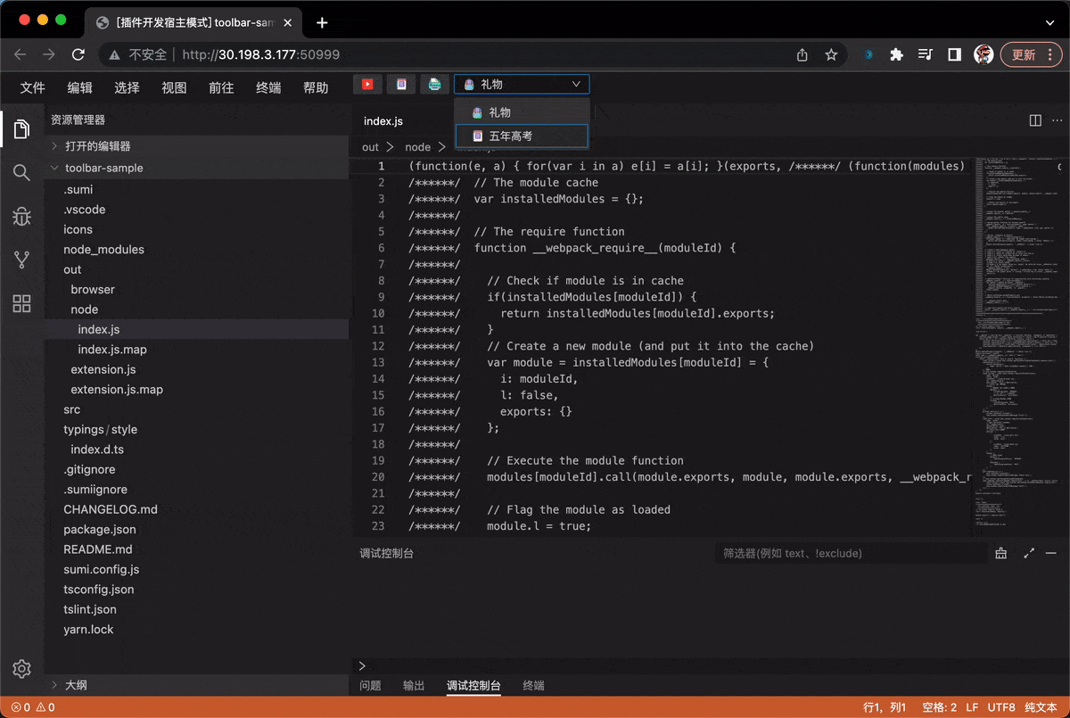
通过 kaitianContributes 中声明 toolbar.actions 的方式可以注册一个 select 类型的 action。
{
	"kaitianContributes": {
  	"toolbar": {
      "actions": [
        {
          "type": "select",
          "description": "儿童节送什么吖",
          // 绑定 do-select command
          "command": "do-select",
          "id": "common-select",
          "iconMaskMode": false,
          // select 下拉值列表
          "options": [
            {
              "iconPath": "/icons/gift.svg",
              "label": "礼物",
              "value": "gift"
            },
            {
              "iconPath": "/icons/book.svg",
              "label": "五年高考",
              "value": "book"
            }
          ],
          "states": {
            // 默认 state
            "default": {
              "labelForegroundColor": "#FF004F"
            },
            "clicked": {
              "labelForegroundColor": "#CCC"
            }
          }
        }
      ]
    },
  }
}
绑定 command
示例中绑定了 do-select 命令,需要在插件代码中注册该命令。
import * as sumi from 'sumi';

export function activate() {
  sumi.commands.registerCommand('do-select', async vlaue => {
    const toolbar = await sumi.toolbar.getToolbarActionSelectHandle(
      'common-select'
    );
    toolbar.setState('clicked');
    sumi.window.showInformationMessage(`Select ${vlaue}`);
  });
}
效果如下:
更新 Options
使用 getToolbarActionSelectHandle 获取到 selectHandle 后,可以调用 setOptions 方法更新其选项列表。
import * as sumi from 'sumi';

export function activate() {
  sumi.commands.registerCommand('do-select', async vlaue => {
    const toolbar = await sumi.toolbar.getToolbarActionSelectHandle(
      'common-select'
    );
    toolbar.setState('clicked');
    sumi.window.showInformationMessage(`Select ${vlaue}`);
    toolbar.setOptions(
      {
        iconPath: '/icons/gift.svg',
        label: '礼物',
        value: 'gift'
      },
      {
        iconPath: '/icons/book.svg',
        label: '五年高考',
        value: 'book'
      },
      {
        iconPath: './icons/book2.svg',
        label: '三年模拟',
        value: 'book2'
      }
    );
  });
}
更新选中项
使用 getToolbarActionSelectHandle 获取到 selectHandle 后,可以调用 setSelect 方法更新其选项列表。
import * as vscode from 'vscode';
import * as kaitian from 'kaitian';

export function activate() {
  vscode.commands.registerCommand('do-select', async vlaue => {
    const toolbar = await vscode.toolbar.getToolbarActionSelectHandle(
      'common-select'
    );
    toolbar.setState('clicked');
    vscode.window.showInformationMessage(`Select ${vlaue}`);
    toolbar.setOptions(
      {
        iconPath: '/icons/gift.svg',
        label: '礼物',
        value: 'gift'
      },
      {
        iconPath: '/icons/book.svg',
        label: '五年高考',
        value: 'book'
      },
      {
        iconPath: './icons/book2.svg',
        label: '三年模拟',
        value: 'book2'
      }
    );
  });
  toolbar.setSelect('book'); // 这里会选中 "五年高考"
}